Design & Creation
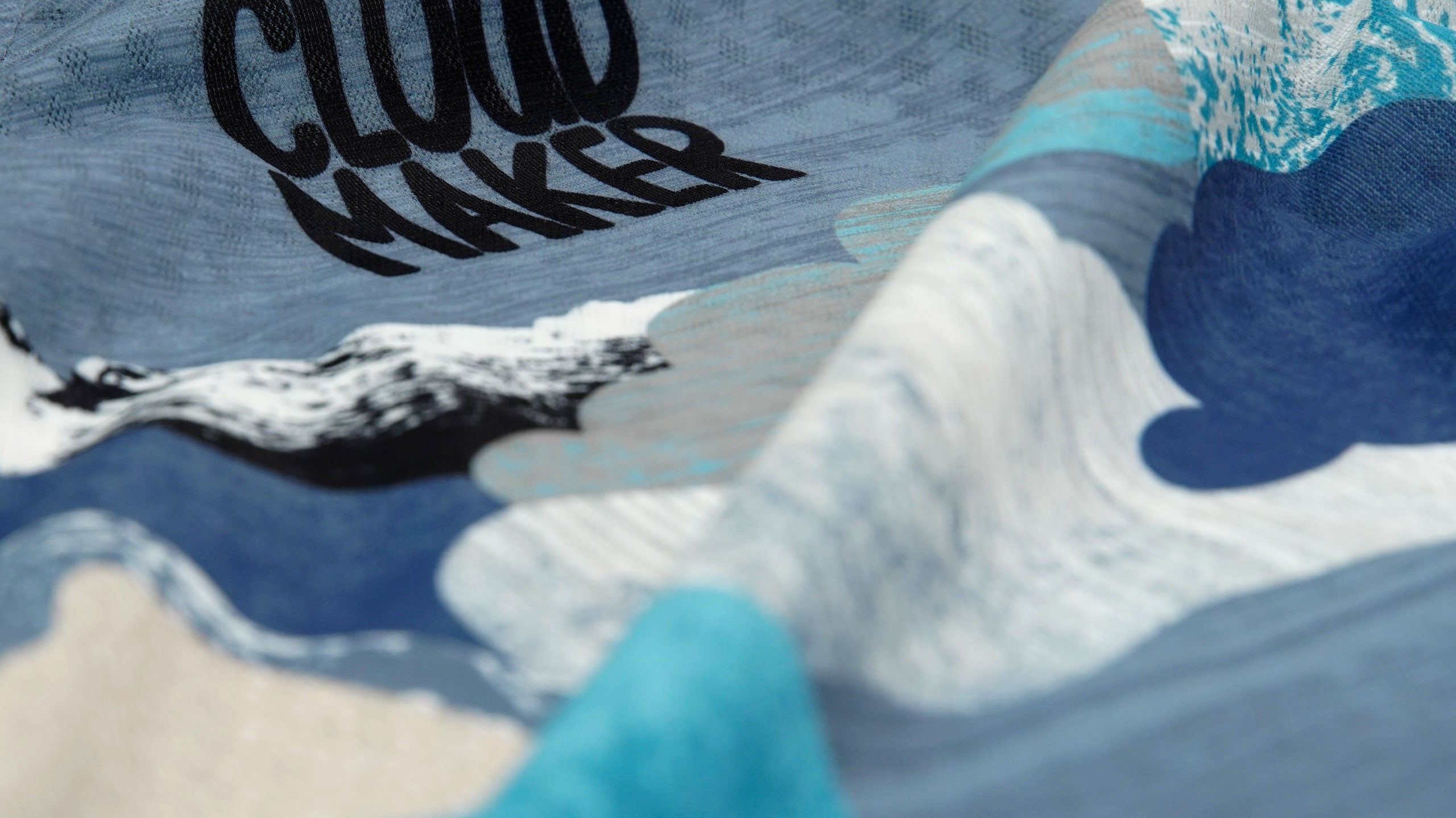
Cloudmaker
From the land of the long white cloud, deep in the heart of South Westland where the clouds are made this design was born. Landscape forged by wind & rain, vertical rock faces, and the relentless west coast weather, Cloudmaker Lake sits majestically...
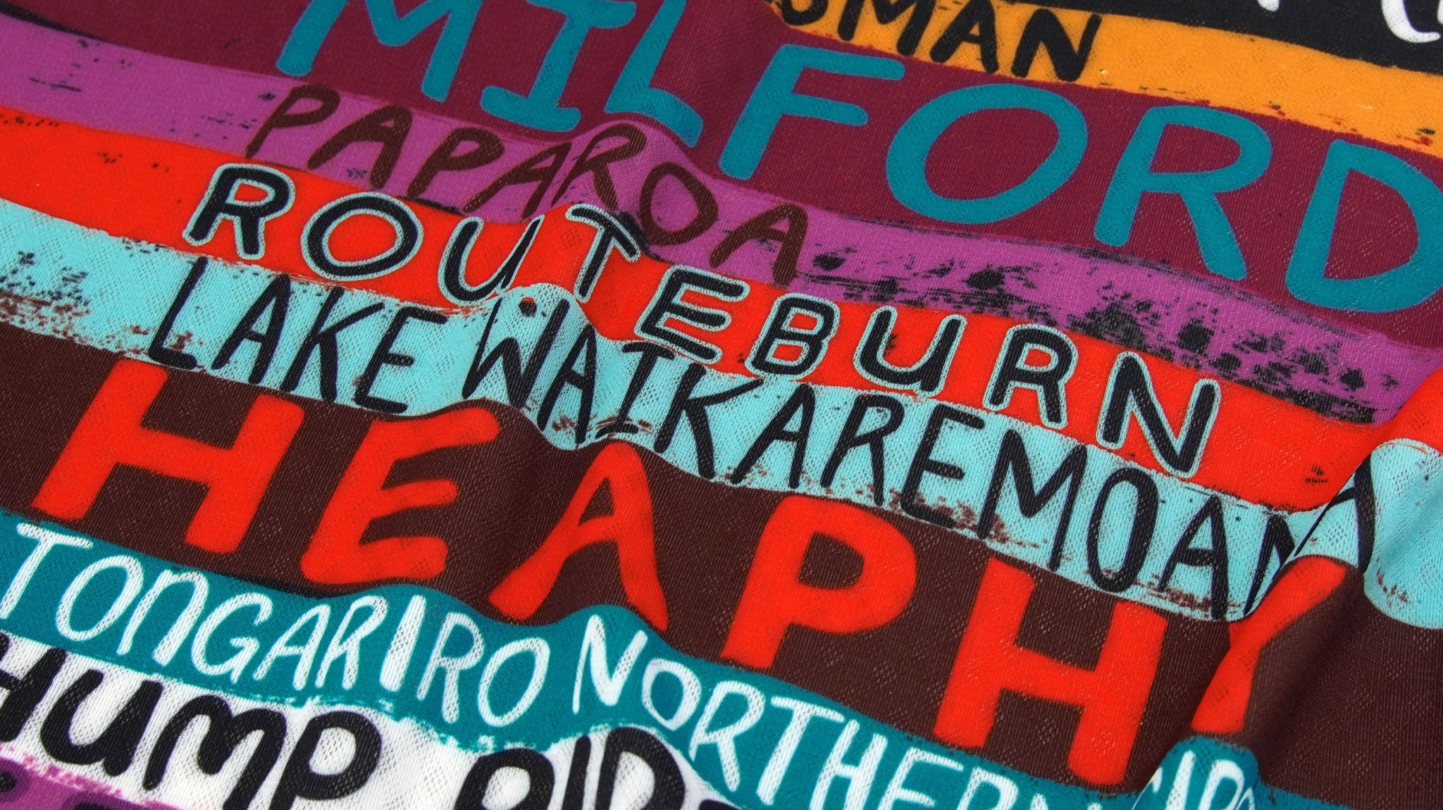
NZ Great Walks
Inspired by the Great Walks of Aotearoa this design is straight from the art studio. Featuring 10 premier hiking tracks hand that pass through the country’s most spectacular scenery and national parks...

Grant Stirling - Needs help!
Important news! Our talented photographer Grant and keenest man on two wheels we know, unfortunately was recently struck down by a Cardiac Arrest. Great news now - he is now on the road/trail to recovery...

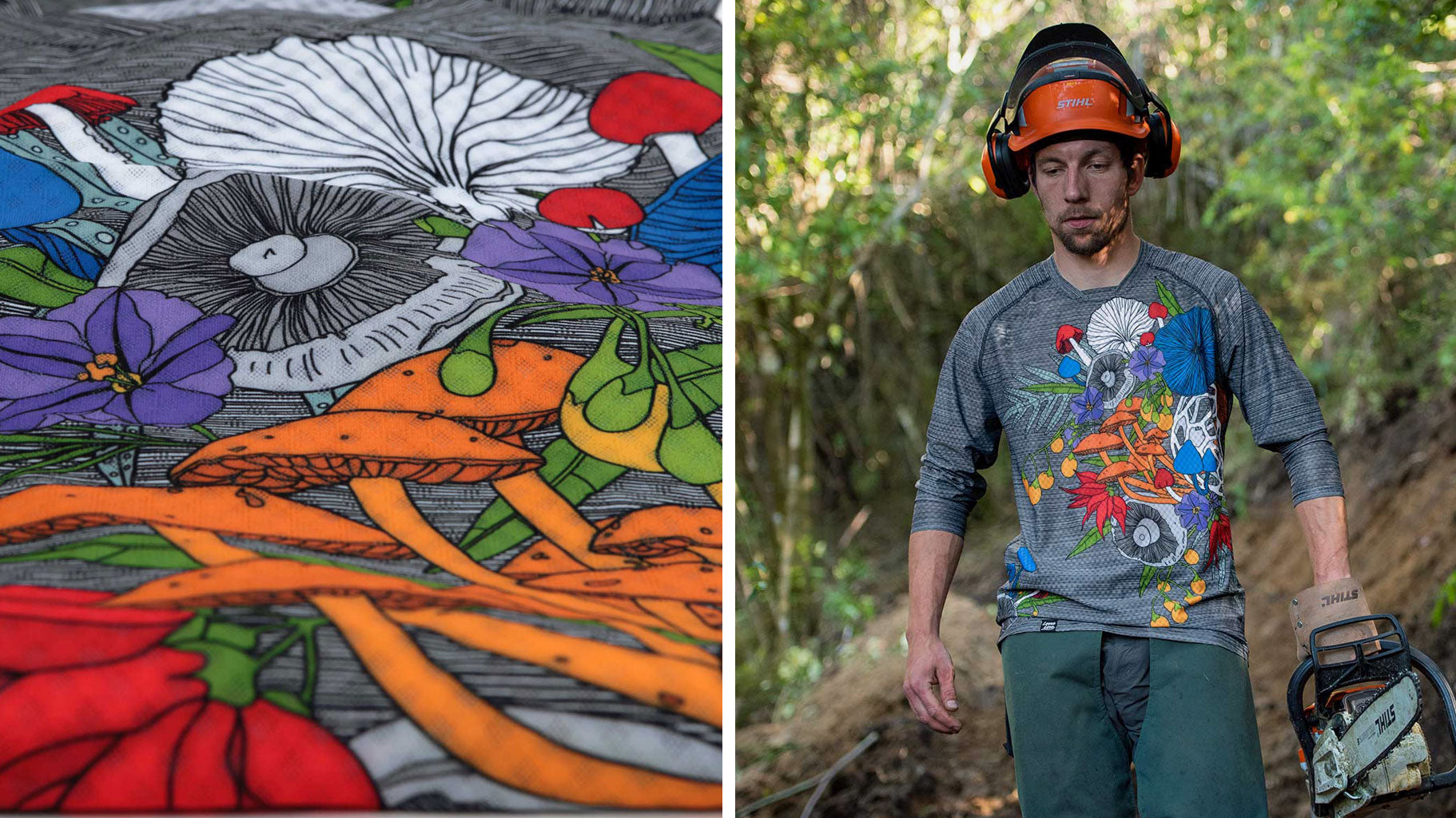
The little blue fungi
This collection (High Speed) was inspired by a little blue fungi found on the edge of the Kahurangi National Park a few years ago, and it became the inspiration behind...
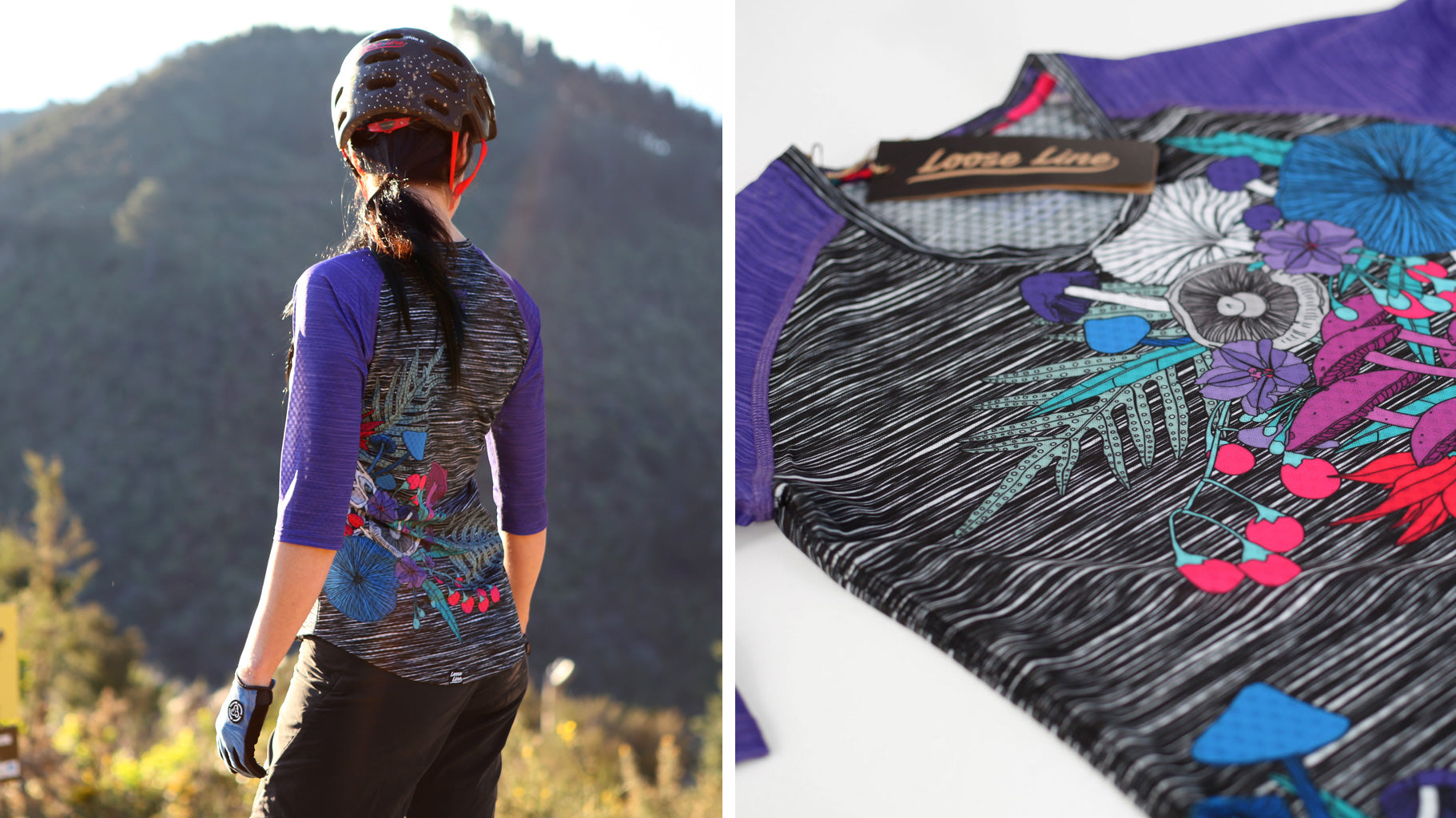
High Speed - Purple Paradise
This is the High Speed - Purple Paradise, inspired by Aotearoa. Starting with the NZ $50 note, we thought the blue fungi - Werewere-Kōkako was pretty cool. We had spotted...
High Speed Men’s
We've been inspired by riding and hiking around Aotearoa, and have decided to bring the native to you. This one was inspired by the NZ $50 note. We threw in the...
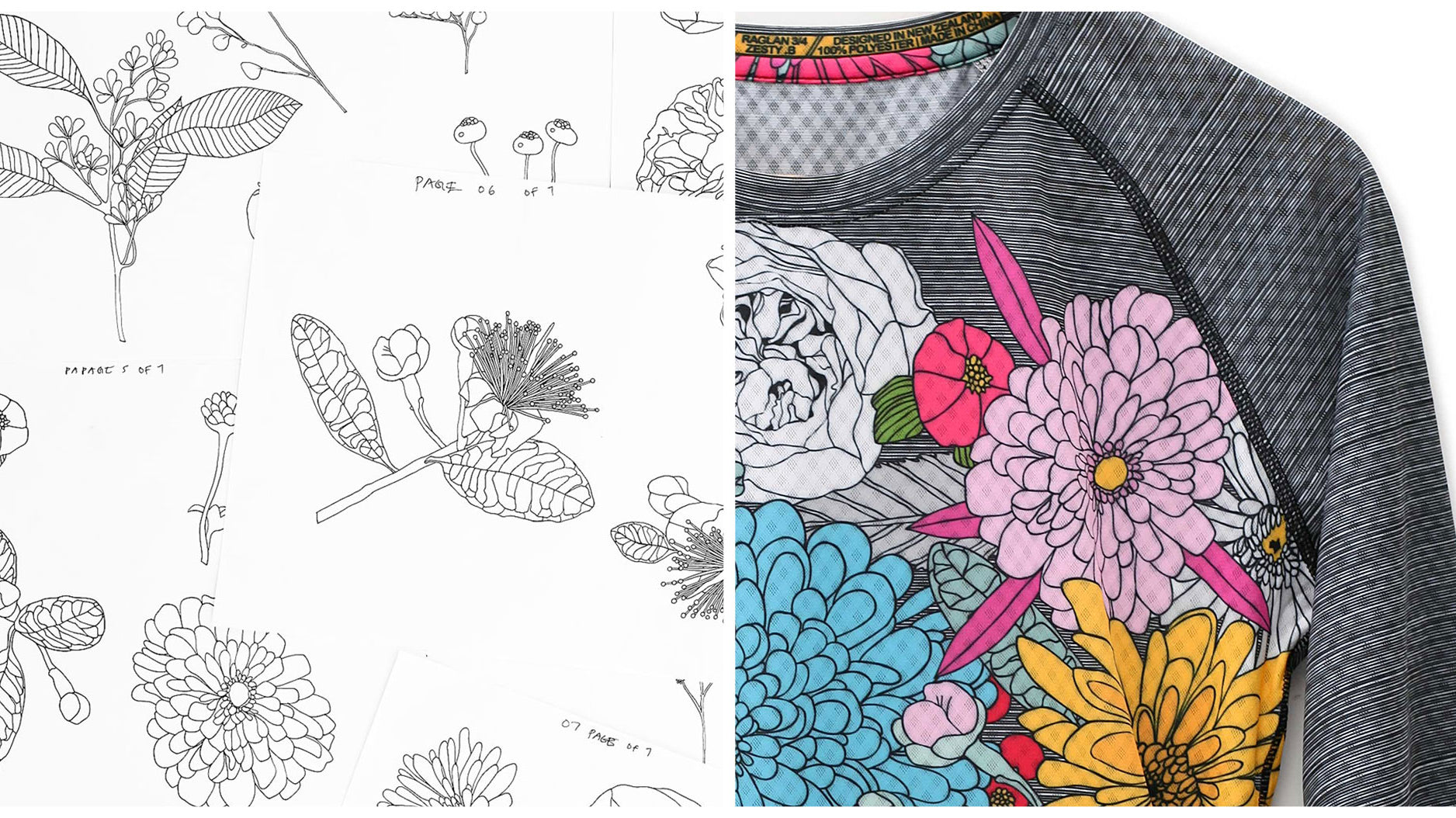
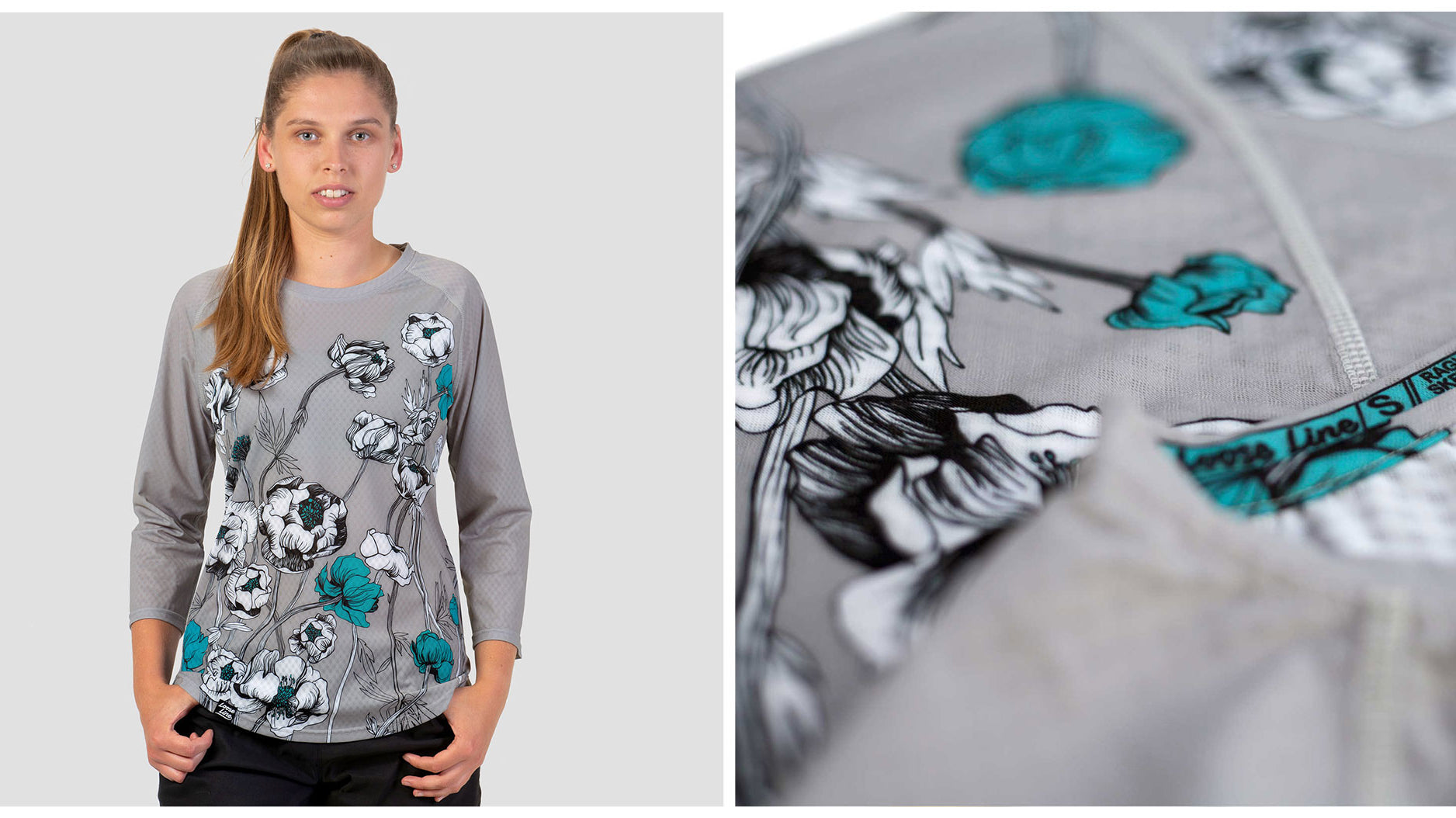
The ZESTY .B design in the making
The ZESTY .B design in the making. Here are a few notes about the design. We start with choosing flowers that have a variety of different shapes and sizes. We...